


Reaching for the White Paint
Sign painters don't always do it in one shot.


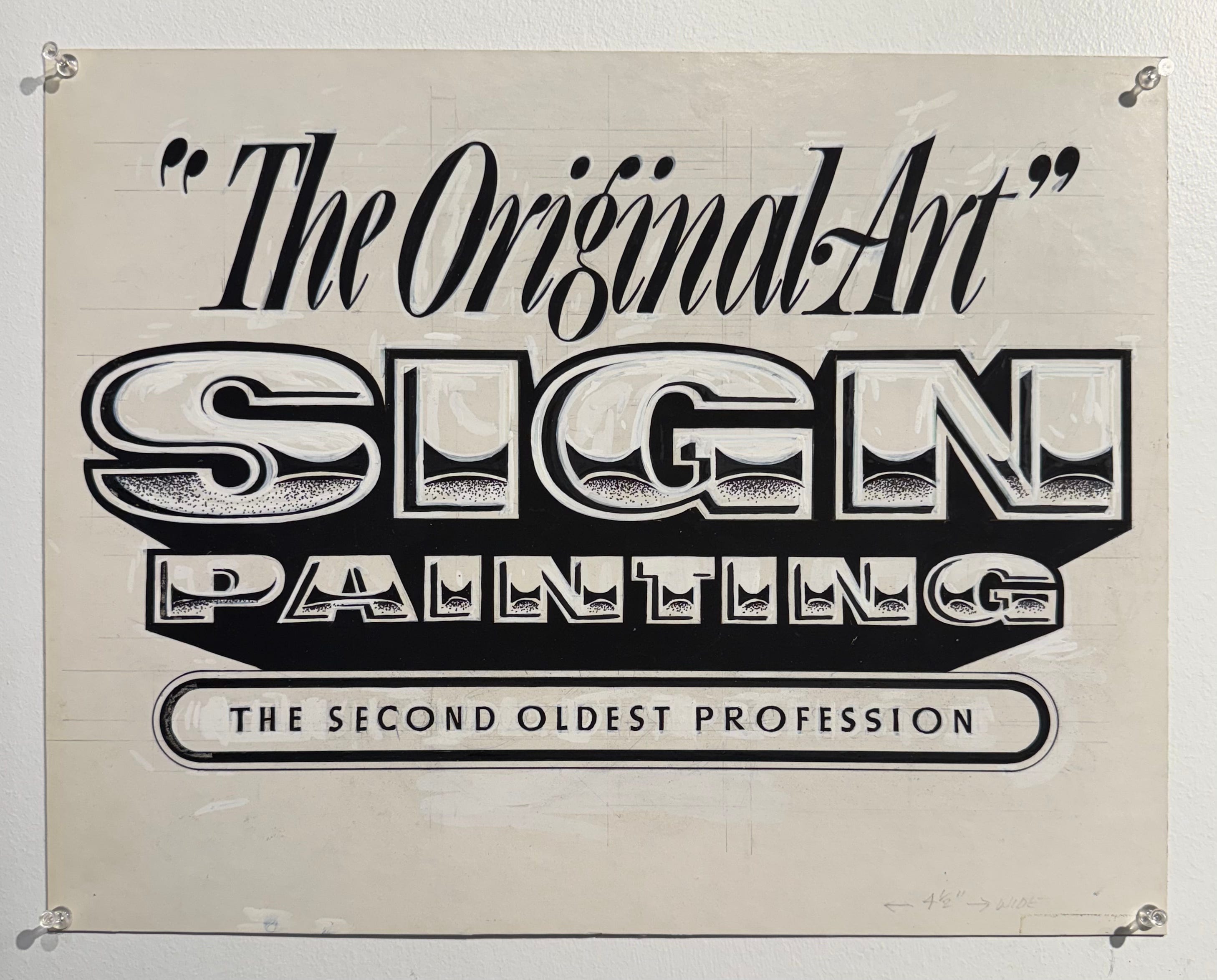
At the American Sign Museum last month, I spent a good bit of time looking closely (literally, face inches away) at showcards by Mike Stevens. The museum was working on a new exhibit to coincide with the upcoming Letterheads Meet, and it will feature a hefty collection of his work.


Stevens passed away at just 46 in 1989; he left behind a massive showcard portfolio, due in part to his ongoing work with San Jose’s Civic Auditorium and other local venues. In the case of the Civic Auditorium, he would paint two showcards to advertise upcoming events, each time snagging the old ones whenever he dropped off the new.
The collection also has other pieces from his portfolio, including originals from his influential book Mastering the Art of Lettering. I cannot emphasize enough the skill Stevens possessed to churn out these showcards, laid out in chalk and painted without any fonts or patterns. However, the more I looked, the more I noticed how many edits he would make with white or black paint to fix his lettering—something that isn’t obvious in books or other printed media.


In the case of big mistakes, he would even take a square of cardstock and glue it over the error (I thought I took a photo but I can’t find it, so you’ll have to take my word for it). This is pretty common for something that was to be photocopied, but seeing it on final deliverables was new to me.
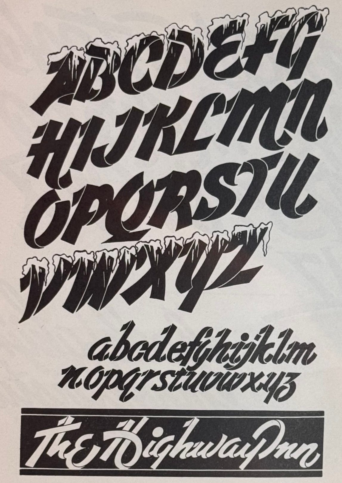
Let’s step back for a moment. One of the first books I bought when I was entering into the world of sign painting was Sign Painters by Faythe Levine and Sam Macon. Timed with the release of the movie, the book was practically a required purchase for anyone in the trade, featuring profiles of veteran sign painters and businesses with interviews and photos. It was through this book and its promotion that I first saw this sign by the talented Jeff Canham, featuring a pun about 1 Shot paint, the ubiquitous oil-based paint used in the trade. I’ve always interpreted it to mean that sign painters can paint a sign in one go, with no fixes, wipes, or mishaps.
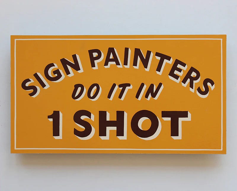
The thing is, I took this sign way too literally. It represented everything I wished I could paint and become: painting-wise, I loved (and still love) a simple, classic layout with a drop shadow, and being-wise, I yearned for my future skill set of painting a sign without any mistakes, each brush stroke laid down perfectly. My time at Los Angeles Trade Tech further rammed this mindset into my brain through our lessons and projects, and while it did shape me into a better sign painter, the emphasis on perfection stifled my creativity.
So back to the museum. As I pored over Stevens’ work, something I already knew became crystal clear: the fear of making a mistake cannot exist in the creative process, because fear is a limiting emotion that keeps you from taking the risks necessary to produce great art. I thought about my own practice, and how painting paper signs could feel too serious, like a test—if I couldn’t paint all the letters perfectly, I would need to start over. By hyper-focusing on the pragmatics of being a great sign painter, I forgot the part where, hmmm, gee, I don’t know, it’s supposed to be fun??
On the other hand, Mike Stevens reworked the living crap out of his paintings until they looked great, going in with white or black paint to clean up mistakes and add effects. He didn’t invent this process; before computers, typeface and lettering designers had to refine their lettering the old-fashioned way, as seen below in Ross F. George’s “Style D” via Letterform Archive.


Maybe this all seems obvious since painting is romanticized to be a slow, evolving practice of working and reworking a canvas, but as I mentioned before, the way sign painting is taught is radically different: it’s about mastering the brush and your hand, pulling straight lines, and being efficient in your brush strokes.
Giving myself the green light to essentially white out any mistakes, I took to my studio. I hadn’t drawn or painted a new alphabet in ages, so I picked out a ribbon text from my library and stared at the letters for a while. I decided it would be best to paint the complete letterforms in black first, allowing for smooth strokes instead of tiny, disjointed ones, and then cut in with white lines to create the effect. I drew out the letters, painted, and then got my tiniest brush and started laying in the white lines.
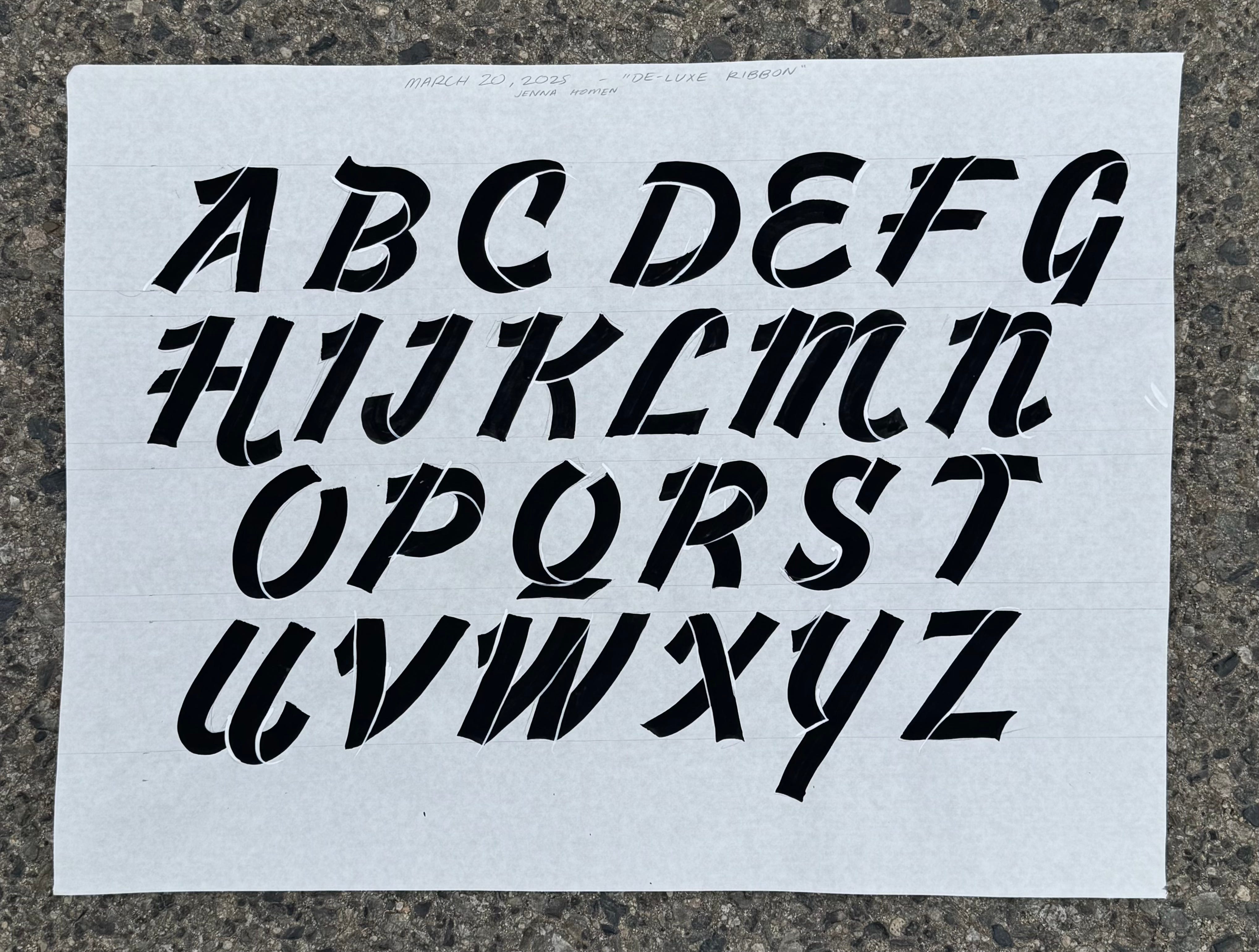


I found that some of the line placements in the reference didn’t mesh with my rendition, so I switched between white and black until each letter felt right. Being open to making mistakes actually helped me learn more, which, shocker, helps me improve at painting. It’s all so obvious I can’t help but laugh. We all love to get in our own way, don’t we?
By the end, I was *insert a heavy Great British Baking Show accent* absolutely chuffed. Perfect? No. A fun time and example of the human hand at play? Yes.


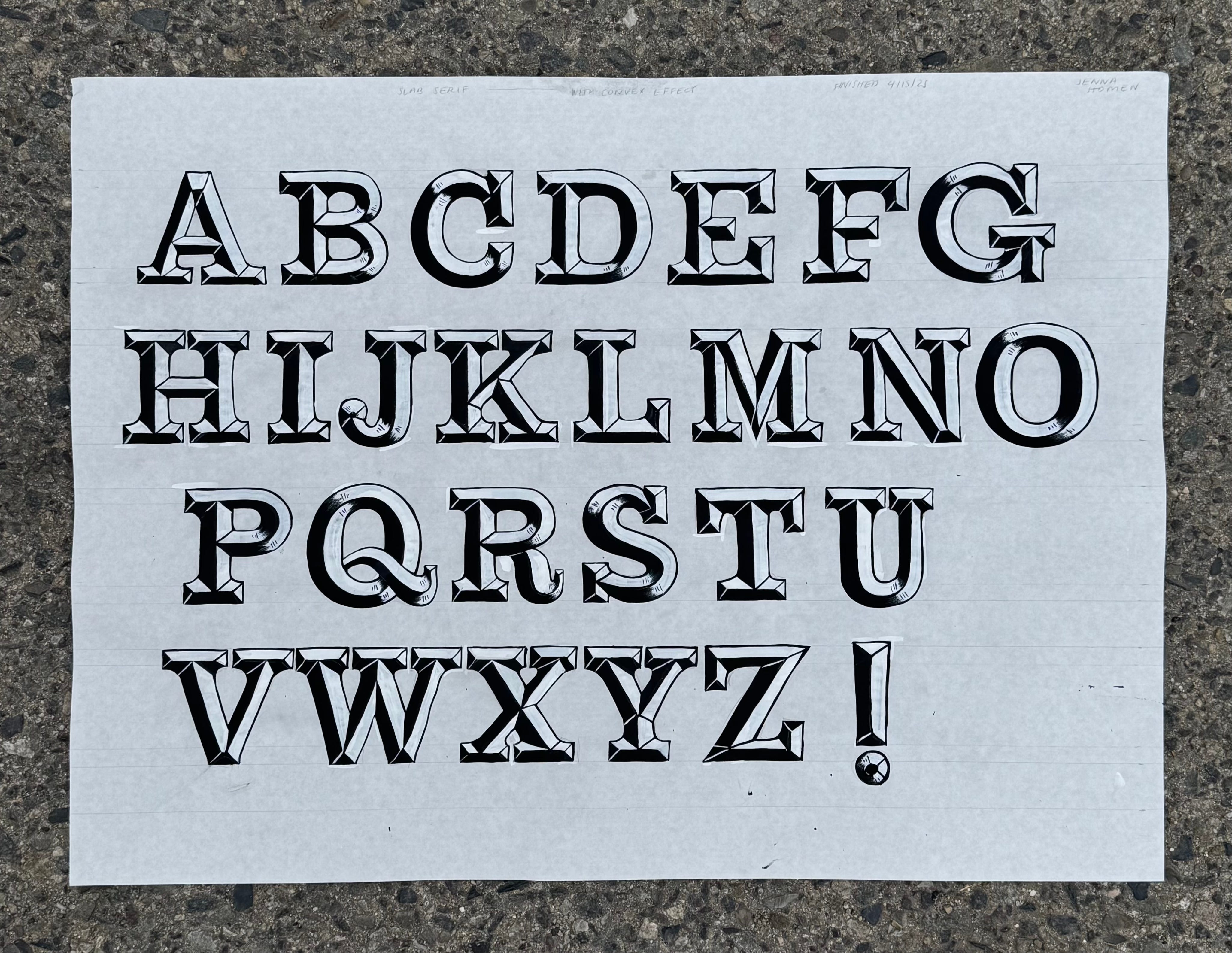
My next experiment involved drawing and painting some chunky slab serif letters, and then using white and black to add convex shadows for a beveled effect. I went back and forth between white and black repeatedly, taking my time. My work, liberated. My joy level, skyrocketing. My understanding of convex shading, still confusing at times but undoubtedly improved. I'm Mike Stevens, bitch!


Committing to sign painting consistently unravels more truths, like that it’s a balancing act between art and craft, prepwork and creative freedom, math and trusting the eye. That you get to carve out your own practice and decide what kind of artist you want to be. That mastery is a myth, and new lessons and epiphanies happen all the time.
So, as it turns out, sign painters don’t do it in one shot. Sign painters do it over and over again. Sign painters make mistakes, because mistakes are just doors, and behind doors is the creative unknown. I hope this helps you find the white paint in your life.
xoxoxoxoxoxo
Jenna
The Quench Tank
In keeping with the theme of The Anvil and the figurative blacksmith shop of my mind, the Quench Tank is my version of water cooler talk where I debrief on what’s happening lately in my world.
Lately, when people ask me “what have you been working on lately?”, I just hear a tinny high-pitched ringing sound. Umm…stuff? Things? The jobs have just been passing through me, y’all. But, to answer the question, I’ve been very much in the iceberg-under-the-surface work, designing and sending emails and THINKING. I just painted a little celebratory sign for Jon & Vinny’s (with a 6am start time, ouchie), am working on a fun project with a beer garden (part of which involves painting faux ghost signs, yay), and collaborating with one of my favorite artists and Substacker Lordcowboy on more signage.
I’m taking a neon class this weekend (!!!) at the Museum of Neon Art with my friend and fellow sign painter Andrea. I’m so excited to see what it takes to bend glass—if all goes well, I will be the owner of my very own neon cactus, which I plan on mounting on my own faux-aged fictional sign that I have yet to design or paint.
Last weekend, I lovingly culled and re-organized my book collection and made my quarterly sacrifice to my local Little Free Library. I am very Richard Bach-pilled right now, recently finishing One and wanting to reread Illusions. Years ago, an ex-boyfriend’s mom gave me a copy of Jonathan Livingston Seagull and I thought it was so weird (my prefrontal cortex wasn’t developed yet), so I should probably reread that soon. I’m finishing up Hermann Hesse’s Siddhartha and will be moving on to Autobiography of a Yogi by Paramahansa Yogananda. I also dipped back into Eckhart Tolle’s Power of Now, which always leaves me feeling a bit lighter, and will randomly open a page of Be Here Now by Ram Dass to see what presents itself to me. When I finally delve back into fiction, Gabriel García Márquez’s One Hundred Years of Solitude is first on my list. What are you reading?
Ok bye for realsies x
Mistakes are doors—so true!
The neon class sounds so fun. It’s so good for your brain to be “bad” at a new thing and trial and error your way through it. We’ve got a surprising amount of neon signs here in Louisville KY (a lot more than I saw on businesses in Chicago which feels odd) so I’ve been working on a Google map of them as I find them.
Love your posts!